How to Choose Paint Colors for Bright South Florida Light
Colors that look neutral in a showroom read differently under Miami's intense natural light. Here's a practical framework for choosing colors that work in Florida homes.
By OOH! Editorial Team
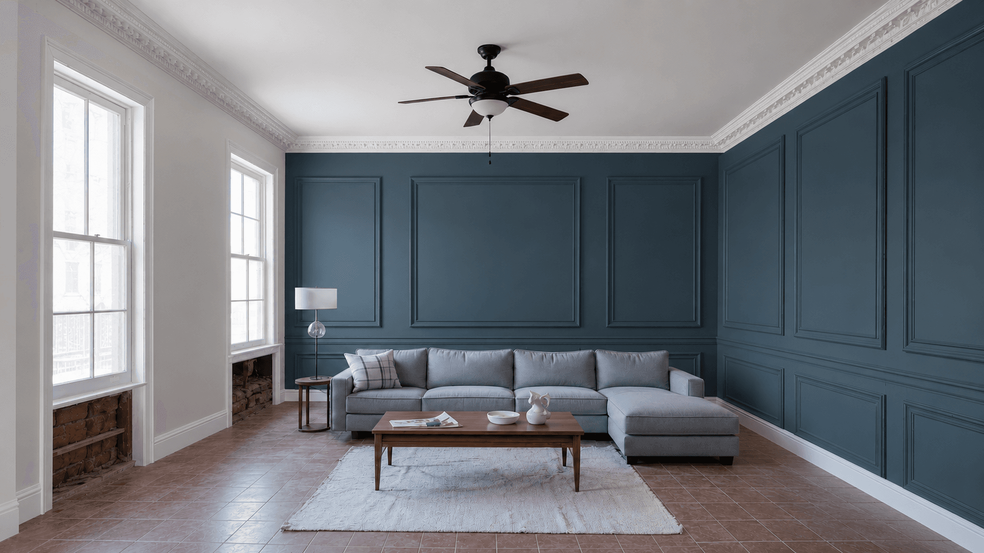
The color you see on a paint chip in a store is not the color you'll see on your wall. That's true everywhere, but it's especially true in Miami. South Florida's natural light is among the most intense in the continental United States — high UV intensity, strong direct sun for much of the year, and reflective surfaces (water, white concrete, light-colored stucco) that bounce light into spaces from unexpected angles. Colors that look calm and neutral in a dimly lit showroom can look harsh, washed out, or unexpectedly warm or cool once they're on a sun-drenched wall. This guide explains how to navigate that gap and make choices that actually work in Florida homes.
What makes South Florida light different
Northern and temperate climates typically have relatively indirect natural light — overcast skies, lower sun angles, and less UV intensity. Interior paint colors are affected by that light and look the way they were designed to look in those conditions.
Miami's light is fundamentally different in a few ways:
- Higher UV index — Miami consistently records UV index values of 8–11 in summer months. This intensifies color rendering and can shift undertones in ways you don't see in a paint store sample.
- Strong reflected light — light-colored exteriors, concrete, white sand, and nearby water reflect light into windows from the south and east, creating additional ambient illumination that doesn't exist in northern climates
- High sun angle — the sun sits high in the sky for most of the year, meaning direct light enters south-facing windows from overhead rather than at a low winter angle. This produces shorter shadows and more even illumination.
- Year-round intensity — there's no extended winter period of low, indirect light that makes warm tones feel cozy. In Florida, interior colors need to work in consistently bright conditions year-round.
Understanding LRV (Light Reflectance Value)
LRV is a number between 0 (absolute black, absorbs all light) and 100 (absolute white, reflects all light). Most interior paint colors fall in the 30–85 range. It's one of the most useful numbers in evaluating a paint color for Miami interiors.
In a high-light environment like South Florida:
- Colors with LRV above 75 can appear very bright and almost glowing under strong natural light — something that reads as clean and fresh in some spaces but can feel stark in others
- Colors in the 45–72 range often read beautifully in Florida — enough depth to look intentional, not so dark that they absorb heat or feel heavy
- Very low LRV colors (below 25) can work as accents but require careful consideration of how they'll feel in summer light
LRV is typically listed on paint brand color cards and searchable on manufacturer websites. It's worth looking up before committing to a color, particularly for large surfaces.
Undertones under intense light
Undertones are the secondary colors that become visible under different lighting conditions. A white that reads as crisp and neutral in a paint store might have yellow, pink, or green undertones that become pronounced under Miami's direct sunlight.
This is the most common source of unhappy paint results. Someone selects a "white" they like at the store, and in their Florida home, it reads greenish or has a distinct yellow cast that they didn't see in the swatch.
To predict how undertones behave in your space:
- Test large samples (not small chips) in the actual room at different times of day
- Look at the sample at mid-morning when direct light is entering, at midday, and in artificial light at night
- Hold the sample next to fixed elements — flooring, countertops, trim — that will be visible alongside it
- Warm undertones (yellow, orange, red) tend to intensify under direct sunlight in Florida, while cool undertones (blue, green, gray) tend to read more neutrally
Colors that work well in Miami interiors
These are general categories, not specific brand colors — but they reflect what tends to photograph well, live well, and hold up over time in South Florida homes:
- Warm whites with neutral undertones — off-whites and warm whites in the LRV 80–88 range read as clean without glowing harshly. The undertone should lean neutral or slightly warm, not blue or green.
- Soft greige (gray-beige) — greiges with moderate LRV (55–70) are probably the most versatile choices in Florida interiors. They're warm enough to feel comfortable, neutral enough not to fight with other elements.
- Muted blues and blue-greens — in homes near water, soft teal, aqua, and slate-blue tones reference the environment and look cohesive. Keep saturation moderate — vivid blues can overwhelm in bright light.
- Sage and soft olive greens — particularly in rooms with wood tones or natural elements. These tend to look fresh and grounded without feeling dark.
- Sand and terracotta — in Florida architecture that embraces the region rather than fighting it, earthy tones can work beautifully, particularly on feature walls or in lower-light areas.
Colors to approach carefully
- Vivid, highly saturated yellows — in bright Florida light, these can be overwhelming and make a space feel hot or anxious. If you want yellow, test it extensively first.
- Stark cool whites with blue or gray undertones — under direct Florida sun, these can feel clinical rather than clean and may cast a faint blue in shadowed areas.
- Deep, saturated reds — tend to intensify aggressively under strong natural light, particularly on large surfaces.
- Very dark colors on large south or west-facing walls — beyond the heat absorption question, these can make a space feel dramatically smaller in Miami's generally open, airy residential style.
The showroom trap
Paint stores are typically lit with warm artificial light (often incandescent or warm LED) at relatively low intensity. That lighting environment makes colors look richer and more appealing than they'll look in a Florida home under direct natural light. Don't commit to a color based only on what it looks like in the store.
How to sample correctly
Small paint chips are nearly useless for making final decisions. Here's a more reliable process:
- Purchase sample pots and paint a minimum 12×12 inch square (larger is better) directly on the wall in the room
- Look at it at different times of day — morning, midday, afternoon, and evening under artificial light
- Observe it on sunny days and overcast days
- Live with it for at least two to three days before deciding
- Sample at least two or three finalists side-by-side on the same wall to compare
Connecting indoor and outdoor color
Many Miami homes have significant indoor-outdoor flow — large glass doors, open lanai spaces, or direct views to outdoor areas from main living spaces. In these homes, the transition between interior and exterior color is visible continuously, and clashing tones can feel jarring.
There's no rule requiring interior and exterior colors to match, but they should be compatible — similar in temperature (both warm or both cool) and related in value. If the exterior is a warm cream stucco, a cool gray interior may feel disconnected. If the exterior is white, almost any interior palette can work as long as the transition zone (visible from outside through the windows/doors) handles the shift gracefully.
For related reading, see best interior paint finishes for Miami homes and condos — the sheen level you choose affects how light reads off the surface as much as the color does.
Frequently asked questions
Should I use different colors in rooms that face different directions?
You can, though it's not required. North-facing rooms receive cooler, more diffuse light and often benefit from slightly warmer tones. South and west-facing rooms receive intense direct light and can handle cooler tones without feeling cold. This is a refinement, not a rule — the more important factor is sampling in the actual room.
Is it worth hiring a color consultant?
For larger projects, whole-home repaints, or homeowners who've had repeated color misses, a qualified color consultant can save significant time and frustration. Many interior designers also include color specification as part of their services. The cost is typically modest relative to the overall project investment.
What if I choose the color and then don't like it after it's painted?
Color changes do happen, and repainting is always an option. The way to reduce this risk is the sampling process described above — testing large swatches in the actual room over multiple days. Committing to a color decision before thoroughly testing it in the space is the most common reason for post-project color regret.
OOH! Editorial Team
Painting professionals in the Miami–Fort Lauderdale area